4K Weeks -- Confronting or Motivating?
4 comments
A while back I stumbled upon an interesting poster by a company called 4K Weeks. The poster, as the name of the company suggests, has something to do with 4000 weeks.

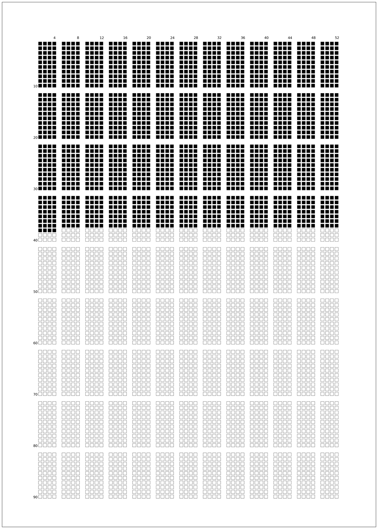
Their idea is that life is short and can easily pass by too fast. They designed a very clean way to visualise your time here on earth in a matrix of weeks. 4K weeks equates to roughly 76 years and, when placed in a matrix of checkboxes, looks quite short! Although it feels a bit confronting, visualising your life in this way is also somewhat motivating!
After thinking about it for a little while I see it as both. It is confronting yes, but looking at such a poster is also pushing me to get my ass of the couch and do something useful!
I really wanted to get my hands on one of these posters, yet they are too expensive to my taste! And that's where my python DIY tinkering comes in to play. I figured I could make such a poster myself with a little bit of tinkering with a Jupyter notebook. And that's what I did! Below is a little script that can generate a 4K look-a-like print for your own age. The scripts takes your birthdate and creates a poster with the correct number of squares filled in already. The remaining ones you would have to mark yourself as life passes by. On the top and left you can see the number of weeks and years respectively.
import matplotlib.pyplot as plt
from matplotlib.patches import Rectangle
from datetime import date
import math

def calculate_age_in_weeks(born):
    birthday = born #datetime.date(YEAR,MONTH,DAY)
    now = date.today()
    delta = now - birthday
    return math.floor(delta.days/7)

# specify your Age using `date(YYYY, MM, DD)`
age = calculate_age_in_weeks(date(1986, 12, 19))

# A3 dimensions in mm
A3Width = 297
A3Height = 420

# Padding on sides and top of poster
offsetX = 25
offsetY = 25

# spacing between week boxes
boxPadding = 1


#define Matplotlib figure and axis
fig, ax = plt.subplots()
fig.set_size_inches(2*A3Width*0.0393701,2*A3Height*0.0393701)

# Some ugly spacing calculations do define week box sizes and paddings
boxSizeX = 100
boxSizeY = ((A3Height-2*offsetY - (9*11)*boxPadding)/(9*11))
boxSize = min(boxSizeX,boxSizeY)
offsetX = (A3Width - 52*(boxPadding+boxSize) - 12*(boxSize+boxPadding))/2
offsetY = (A3Height - 90*(boxPadding+boxSize) - 8*(boxSize))/2

# limits based on A3 Paper
ax.set(xlim=(0, A3Width), ylim=(-A3Height, 0))

# Set some iterators and counters
skip = 0
counter = 0

#add rectangle to plot

# Loop over years
for years in range(90):

    # skip a row after every 10 years
    if (years)%(10) == 0:
        skip += 1

    # Loop over 4-week months (13 in a 52 week year.
    for month in range(13):

        # Loop over 4 weeks and then skip a column
        for week in range(4):
            counter += 1

            # Based on birthdate fill week boxes
            if counter < age:
                fillBox = True
            else:
                fillBox = False

            # Compute box position including the padding and colum/row skipping
            PositionX = offsetX + week*boxSize+month*5*(boxSize+boxPadding)+week*boxPadding
            PositionY = -offsetY-(years+skip)*boxSize-(years + skip)*boxPadding

            # Draw the square at the correct position
            ax.add_patch(Rectangle(xy=(PositionX, PositionY), width=boxSize, height=boxSize,
                         edgecolor = 'black',
                         facecolor = 'black',
                         fill=fillBox,
                         lw=0.5))

# Plot week numbering
plt.text(offsetX+3*(boxSize+boxPadding)+0.25*boxSize, -offsetY+boxSize/2, '4',fontsize=12)
plt.text(offsetX+8*(boxSize+boxPadding)+0.25*boxSize, -offsetY+boxSize/2, '8',fontsize=12)
plt.text(offsetX+13*(boxSize+boxPadding)+0.0*boxSize, -offsetY+boxSize/2, '12',fontsize=12)
plt.text(offsetX+18*(boxSize+boxPadding)+0.0*boxSize, -offsetY+boxSize/2, '16',fontsize=12)
plt.text(offsetX+23*(boxSize+boxPadding)+0.0*boxSize, -offsetY+boxSize/2, '20',fontsize=12)
plt.text(offsetX+28*(boxSize+boxPadding)+0.0*boxSize, -offsetY+boxSize/2, '24',fontsize=12)
plt.text(offsetX+33*(boxSize+boxPadding)+0.0*boxSize, -offsetY+boxSize/2, '28',fontsize=12)
plt.text(offsetX+38*(boxSize+boxPadding)+0.0*boxSize, -offsetY+boxSize/2, '32',fontsize=12)
plt.text(offsetX+43*(boxSize+boxPadding)+0.0*boxSize, -offsetY+boxSize/2, '36',fontsize=12)
plt.text(offsetX+48*(boxSize+boxPadding)+0.0*boxSize, -offsetY+boxSize/2, '40',fontsize=12)
plt.text(offsetX+53*(boxSize+boxPadding)+0.0*boxSize, -offsetY+boxSize/2, '44',fontsize=12)
plt.text(offsetX+58*(boxSize+boxPadding)+0.0*boxSize, -offsetY+boxSize/2, '48',fontsize=12)
plt.text(offsetX+63*(boxSize+boxPadding)+0.0*boxSize, -offsetY+boxSize/2, '52',fontsize=12)

# Plot year numbering
plt.text(offsetX-boxSize*3/2, -offsetY-10*(boxPadding + boxSize), '10',fontsize=12)
plt.text(offsetX-boxSize*3/2, -offsetY-21*(boxPadding + boxSize), '20',fontsize=12)
plt.text(offsetX-boxSize*3/2, -offsetY-32*(boxPadding + boxSize), '30',fontsize=12)
plt.text(offsetX-boxSize*3/2, -offsetY-43*(boxPadding + boxSize), '40',fontsize=12)
plt.text(offsetX-boxSize*3/2, -offsetY-54*(boxPadding + boxSize), '50',fontsize=12)
plt.text(offsetX-boxSize*3/2, -offsetY-65*(boxPadding + boxSize), '60',fontsize=12)
plt.text(offsetX-boxSize*3/2, -offsetY-76*(boxPadding + boxSize), '70',fontsize=12)
plt.text(offsetX-boxSize*3/2, -offsetY-87*(boxPadding + boxSize), '80',fontsize=12)
plt.text(offsetX-boxSize*3/2, -offsetY-98*(boxPadding + boxSize), '90',fontsize=12)

# Remove ticks and borders of plot
plt.tick_params(left = False, right = False , labelleft = False ,
            labelbottom = False, bottom = False)

# Save figure as PNG withouth XKCD style
plt.savefig('4Kweeks.png',dpi=300,bbox_inches='tight')

plt.show()
If you want to create one yourself, simply run the notebook and an A3 image is created with the poster. The repo of this script can be forked from GitHub. If you're not familiar with Python but love the poster, let me know your date of birth and I can create one for you.
Disclaimer: This script I wrote merely creates my own interpretation of a graphic of a life in weeks. For the original version please refer to the 4K weeks website.
Comments