Posting and Voting Time on Hive | 2D Surface Chart
1 comment
This is a chart from a recent post on posting and voting time. I did it for the first time, as an option to the heatmap that I had previously. The colors doesnt match perfectly, but it was the best choice, becouse even if I put the same theme for the charts, it returned diferent colors.
Still quite good visualtization I thing.
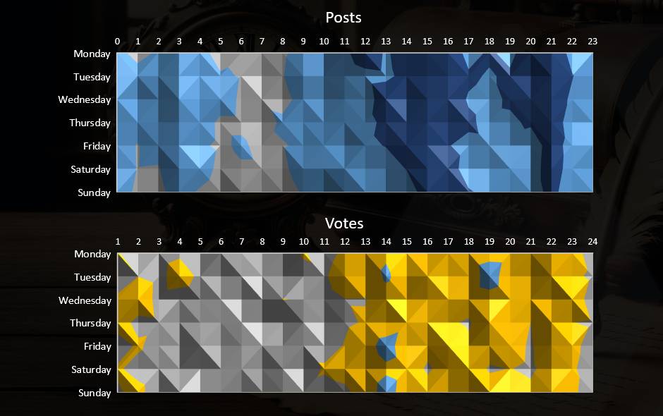
UTC time.
Waivio AI Assistant
How can I help you today?
Comments