What is a Heatmap and How to use it
8 comments
What is a Heatmap?
Lately I have been asked a lot of question of price actions of different entities. There are always folks who are trying to adapt to new price environemnt in trading, or just trying to learn a new tool. This is a great idea, as we should always try to improve our skill set. A Heat Map is simply a representation of price in a map format. It can be a physical map with color overlays on it, or it can be just a rectangular box of all S&P 500 stocks. Let me give you and example or two:
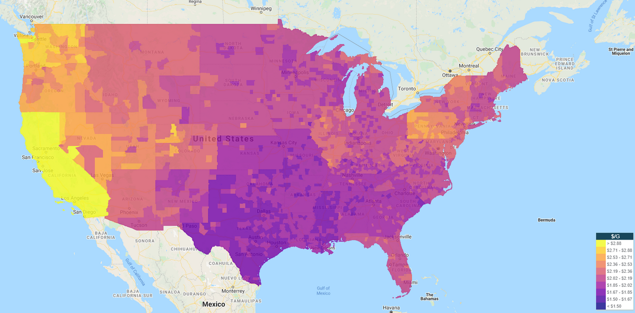
Above is a heat map of price of gasoline across the continental United States. We all know that the gasoline price varies from place to place. Just a quick glance at this map will tell you that gasoline is expensive around west coast, California in particular; and it is cheap where I live in Texas :)
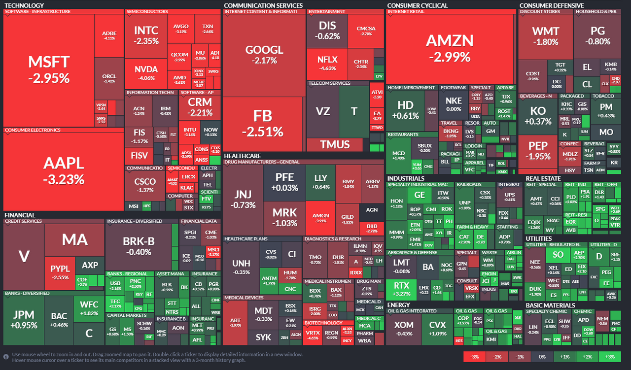
Above is a heat map of all stock in the S&P 500 index on last Friday, Oct 2nd, 2020. There are exactly 500 boxes in that display above. Their size is proportional to their weighting in the index, which is proportional to their respective Market Cap. Also they are organized into different sectors. Above is the percentage of movement of stocks during that single day. Looking at it it is easy to see the pattern. We can look at a daily chart of SPX and tell that the market was down by about 1% or 32 points on Friday. But Tech stocks had a bad day. They were down by 2 - 3% and outperformed the market to the downside. Also important to note, how heavily weighted the market is on the tech/communication stocks and AMZN. Nearly third of the market is just those :)
How to Use a Heat Map
A heat map has many usage:
- Quick idea of the pattern that is otherwise not reflected in the simple chart
- Hidden trends within the market
- Sector rotation
- Underperformance and Outperformance
All these will be aparent when you look at the market heatmap at multiple time scales. Let me explain:
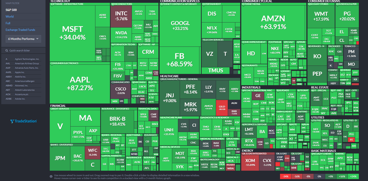
Over last 6 months, Market did excellent! Covid doesn't exist if you look at the market :)
The only bad patch in the market was the Energy Sector, and some isolated biotech. They underperformed the market by a large margin.
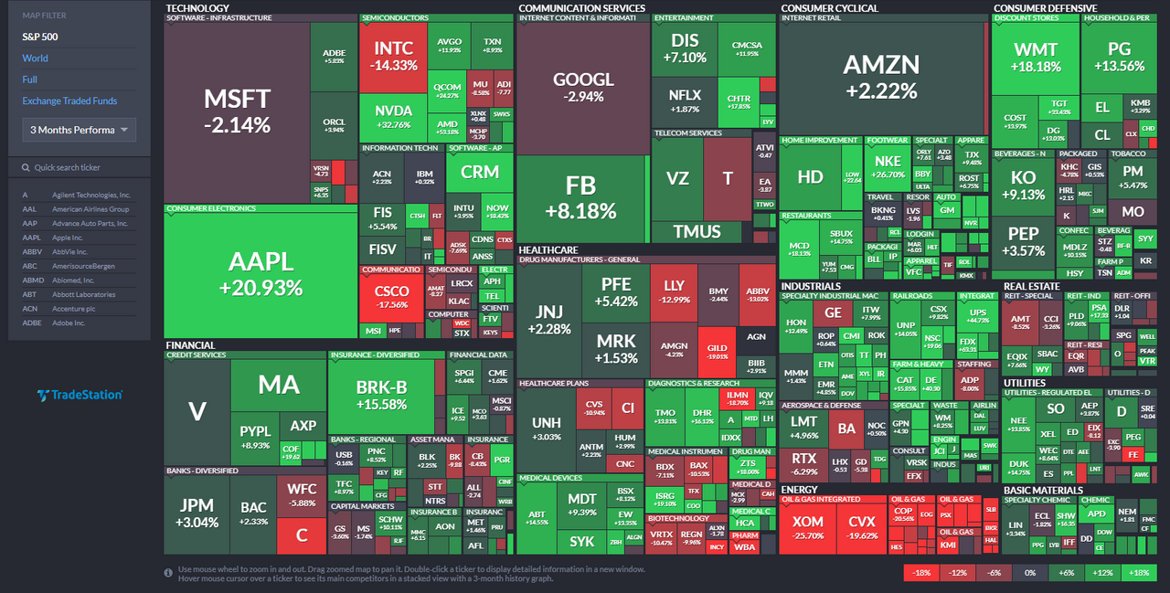
Same chart. Now looking at 3 months. You will see now it is highly variable. Tech did good, but really only AAPL and FB. INTC didn't do very well. Energy remains a bad patch. But both credit cards and grocery store did well. Do you see any patterns emerging?
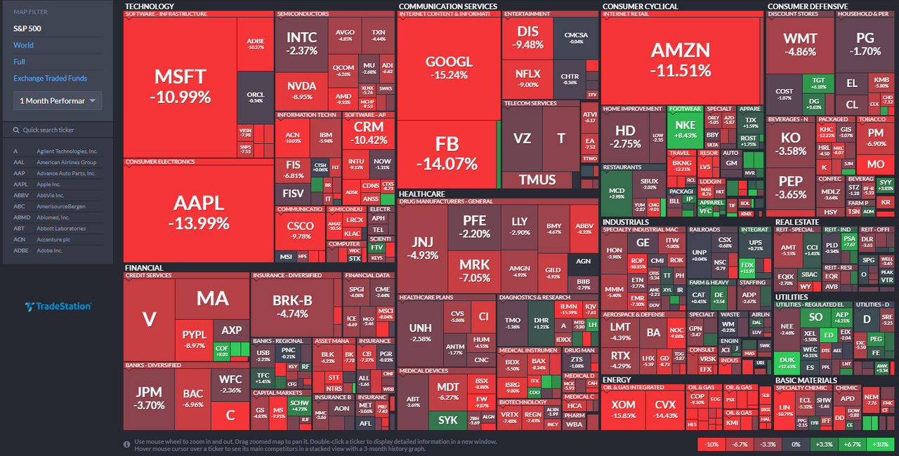
Same chart. Now looking at only the last month. Market did fairly bad last month. It's pretty much all over, but Tech is down more than the rest of the sectors. Energy remains a dog. Something up like NKE? Maybe a earning report or some other news? Also people buying utilities, eh? Not a good sign. Utilities are considered defensive, so a sector rotation from Tech to Utilities typically suggests bad times ahead :)

Comments